


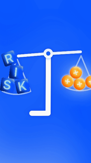

I initiated the project by familiarizing myself with the EPFX brand, studying their platform, brand guidelines, and visual elements. Navigating their website and figma board provided additional insights. Utilizing this information and a provided audio clip, I generated creative ideas such as visualizing "so easy to get lost" with a graph arrow arriving at a pathsplit.
I strategically planned the project, considering deadlines, budget, and efficiency, resulting in a smooth workflow and high-quality outcome.
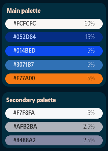
Adhering closely to brand design guidelines, I replicated the brand's use of colors, 3D objects, glow, and lighting, adopting a quasi-skeuomorphic approach.

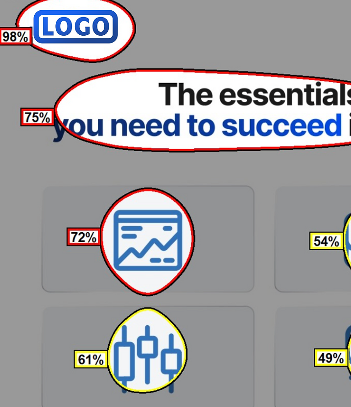
Using tools for visual attention analysis, I was able to utilize the 5 visual elements our eyes are attracted to: Edges, Intensity, Red-Green Contrast, Blue-Yellow Contrast, and faces. This allowed me to create great visual hierchies and natural order of animation, while also being aware of what people are more likely paying attention to in my compositions.
For example, the website design originally had too much attention on the logo.
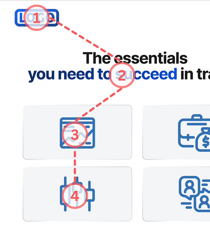
Rather than modifying the logo, I increased the contrast in the pictograms used, affecting the intensity of the pictograms, and used that to change the order of the pictogram animations, and made the text animate in later not to overwhelm viewers.
Here are some of the final videos: